SIGNAL_ACQUIRED // HELLO_WORLD

AARYAN
YADAV

DATA_ANALYST & VIZ_ENGINEER

Turning raw data into stories that drive decisions.
One dashboard at a time. Operating from the data sprawl.

VIS_ID :: 0xA17
Aaryan Yadav // REC FILE :: aaryan.jpg
/ABOUT

// OPERATOR_PROFILE

cat ./bio.txt

~/aaryan/bio.txt
whoami --verbose

Data Analyst with experience in SQL, Python, and data visualization tools like Tableau. Skilled in data cleaning, exploratory data analysis, and building dashboards to derive actionable business insights. Strong background in software development with experience on analytics-driven products.

02+ PROJECTS_SHIPPED
40K+ RECORDS_ANALYZED
05+ TOOLS_OPERATED
B.TECH🜂 CSE-AI
/PROJECTS

// FIELD_OPERATIONS

Here's what I've been building. Click_to_decrypt

GoogleSheets PivotTables DashboardDesign
Sales Performance dashboard preview

Sales Performance Optimization & Demand Forecasting

A KPI-driven sales intelligence framework analyzing daily revenue across 1,115 stores — uncovering the impact of promotional cycles and holiday trends on store performance using interactive dashboards.
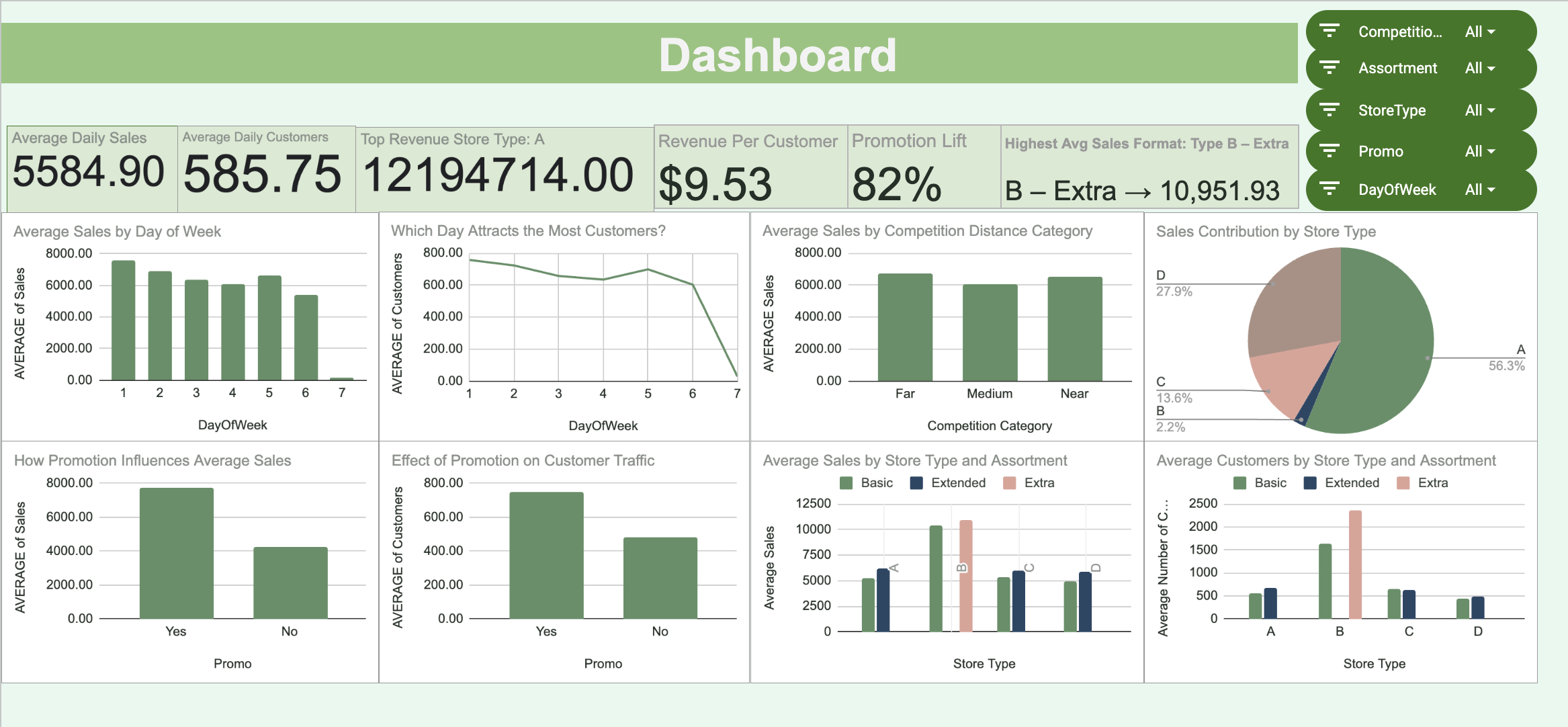
  • Analyzed sales records for over 1,100 unique stores; built interactive KPI dashboards with dynamic filters for Store Number, Day of the Week, and Promo Status.
  • Engineered 3 derived metrics: Promo Conversion Rate, Holiday Sales Variance, and Customer Footfall Efficiency (Sales per Customer).
  • Identified that Promo2 (extended promotion) significantly increases long-term sales stability, with the highest revenue peaks during Regular Promo cycles across all store segments.
Python Tableau Jupyter Pandas Seaborn
Spotify Retention & Churn dashboard preview

Spotify User Behavior & Pattern

Processed and cleaned multi-dimensional Spotify user datasets using Python (Pandas), addressing data inconsistencies to ensure reliable analysis of listening habits and subscription transitions.

  • Engineered behavioral KPIs such as Engagement Score, Churn Rate, Average Daily Listening Hours, and Content Diversity Index to quantify user interaction levels.
  • Built a dual-view Tableau dashboard (Executive + Operational) featuring interactive filters for Subscription Plan, Device Type, Age Group, and Preferred Genre to visualize global user trends.
  • Conducted churn and retention analysis by correlating listening frequency with device usage, identifying that Premium users on mobile devices exhibit the highest retention rates and engagement levels.
/TOOLKIT

// LOADED_MODULES

npm ls --depth=0

LANG & QUERY

Python SQL

LIBS & ANALYSIS

Pandas NumPy Matplotlib Seaborn SciPy

VISUALIZATION

Tableau Looker_Studio Sheets_Dash

TOOLS & FLOW

Excel Jupyter Colab GitHub Agile/Scrum
/EDUCATION

// TRAINING_LOG

B.TECH — CS & ARTIFICIAL INTELLIGENCE

Newton School of Technology · Rishihood University
2024 – 2028 CGPA :: 7.95 / 10 // ONGOING

INTERMEDIATE — CLASS XII

Cecil Convent School · Ambala
2023 – 2024 83.2%

MATRICULATION — CLASS X

Cecil Convent School · Ambala
2021 – 2022 89.8%
/CONTACT

// OPEN_CHANNELS

Open to opportunities, collaborations, and interesting data problems.

MAIL EMAIL aaryan.yadav2024@nst.rishihood.edu.in LINK LINKEDIN linkedin.com/in/aaryan-yadav-272b8a315/ CODE GITHUB github.com/69Igris